Exploring Data Visualization with Matplotlib and Seaborn : A Tour of Plots
Any data scientist or analyst's toolkit should include data visualization. It enables you to convey intricate information in a simple and visual manner, making it simpler for others to comprehend your conclusions. Using two well-known Python tools, Matplotlib and Seaborn, we'll set off on a voyage through the realm of data visualization in this blog. We'll look at a range of stories that these libraries have to offer, showing their skills and use cases.
Matplotlib
A key library for developing static, animated, and interactive visualisations in Python is called Matplotlib. It offers a large selection of plotting options and is quite customizable. Let's examine some of Matplotlib's most popular plots.
Line Plot
For displaying historical trends or correlations between two continuous variables, line graphs are ideal. In case of Bivariate Analysis Line Plot has been used, It can be drawn between Categorical - Numerical or Numerical - Numerical features. One of the use cases of line plot is Time series data. Normally we use matplotlib’s plot() function to draw a line plot . Here is an example of a line plot.
import matplotlib.pyplot as plt

# Sample data
x = [1, 2, 3, 4, 5]
y = [10, 12, 5, 8, 7]

plt.plot(x, y)
plt.xlabel('X-axis')
plt.ylabel('Y-axis')
plt.title('Line Plot')
plt.show()
Scatter Plot
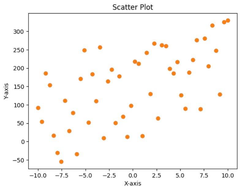
Scatter plots are excellent for showing how two variables are distributed and how they relate to one another. In case of Bivariate Analysis Scatter Plot has been used, It can be drawn between Numerical - Numerical features. One of the use cases of line plot is Finding correlation. They are creatable with plt.scatter().
# plt.scatter simple function
import numpy as np
import matplotlib.pyplot as plt

x = np.linspace(-10,10,50)
y = 10*x + 3 + np.random.randint(0,300,50)

plt.scatter(x,y)
plt.scatter(x, y)
plt.xlabel('X-axis')
plt.ylabel('Y-axis')
plt.title('Scatter Plot')
plt.show()
#Colored Scatter Plot
plt.scatter(iris['SepalLengthCm'],iris['PetalLengthCm'],c=iris['Species'],cmap='jet',alpha=0.7)  ## Use any dataset of your choice, here i've used iris data.

plt.xlabel('Sepal Length')
plt.ylabel('Petal Length')
plt.colorbar()
Bar Plot
Bar plot are suitable for comparing categorical data. It can be used for Bivariate Analysis. In case of plotting, we have categorical variable on x-axis and numerical variable on y-axis. plt.bar() function has been used to create a bar plot in matplotlib.
import matplotlib.pyplot as plt

# Sample data
categories = ['A', 'B', 'C', 'D']
values = [10, 15, 7, 12]

plt.bar(categories, values)
plt.xlabel('Category')
plt.ylabel('Value')
plt.title('Bar Plot')
plt.show()
Histogram
Histograms help you understand the distribution of a single variable. Basically it is applicable for Univariate Analysis. We need a numerical column to plot a Histogram where plt.hist() function plays a pivotal role to draw the diagram.
import matplotlib.pyplot as plt

# Sample data
data = [1, 2, 2, 3, 3, 3, 4, 4, 5, 5, 5, 5]

plt.hist(data, bins=5)
plt.xlabel('Value')
plt.ylabel('Frequency')
plt.title('Histogram')
plt.show()
Pie Chart
A pie plot, also called a pie chart, is a circular graph that has been divided into slices, each of which represents a percentage of the entire graph. The relative frequency or proportion of a category within the dataset is represented by the size of each slice. Pie charts are great for emphasizing the parts-to-whole relationship and for visualizing the distribution or composition of categories in a dataset. Some of the use cases are Categorical Distribution, Percentage contribution, etc. It can be used for Univariate/Bivariate Analysis where values are numerical and labels are Categorical.
import matplotlib.pyplot as plt

categories = ['Category A', 'Category B', 'Category C', 'Category D']
values = [25, 30, 15, 20]
plt.pie(values, labels=categories, autopct='%1.1f%%', startangle=90)
plt.title('Categorical Distribution')
plt.axis('equal')
plt.show()
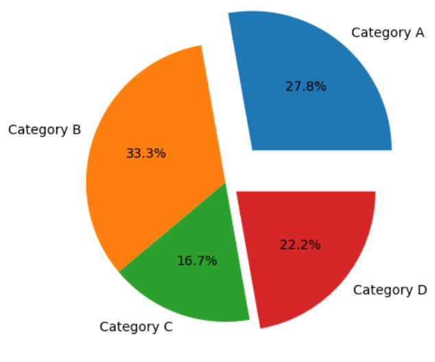
There’s another version of a pie chart called an exploded pie chart :
import matplotlib.pyplot as plt

categories = ['Category A', 'Category B', 'Category C', 'Category D']
values = [25, 30, 15, 20]
plt.pie(values,labels=categories,autopct='%0.1f%%',explode=[0.3,0,0,0.1])
plt.show()
Subplot
With Matplotlib, subplots, you may insert numerous plots into a single figure. Every subplot functions as its own blank canvas on which you can create a distinct diagram or plot. When comparing many datasets or visualizing various parts of your data simultaneously, this is tremendously helpful.
fig, ax = plt.subplots(nrows=2,ncols=2,figsize=(8,5))

ax[0,0].scatter(batters['avg'],batters['strike_rate'])
ax[0,0].set_title('Avg Vs Strike Rate')


ax[0,1].scatter(batters['avg'],batters['runs'])
ax[0,1].set_title('Avg Vs Runs')


ax[1,0].hist(batters['avg'])
ax[1,0].set_title('Avg')


ax[1,1].hist(batters['runs'])
ax[1,1].set_title('Runs')


plt.show()
3D Surface Plot
Three-dimensional data is shown as a surface using data visualisation techniques such as Matplotlib's 3D surface plots. When you want to visualise the relationship between two continuous variables (X and Y) and a third dependent variable (Z), they are especially helpful. As you walk along the X and Y axes, these graphs produce a surface that symbolises the shifting values of Z.
x = np.linspace(-10,10,100)
y = np.linspace(-10,10,100)
xx, yy = np.meshgrid(x,y)
z = xx**2 + yy**2
fig = plt.figure(figsize=(10,8))

ax = plt.subplot(projection='3d')

p = ax.plot_surface(xx,yy,z,cmap='viridis')
fig.colorbar(p)
Contour Plot
Graphical representations of three-dimensional data on a two-dimensional plane are called contour plots. They display the levels of a function of two continuous variables, usually designated as X and Y, as well as the corresponding values of a third variable, Z, using contour lines or filled regions. A particular constant value of Z is represented by each contour line. In several disciplines, including physics, engineering, geology, and data analysis, contour plots are frequently employed. Here is an example if you see a 3D surface plot from above.
fig = plt.figure(figsize=(12,8))

ax = plt.subplot()

p = ax.contourf(xx,yy,z,cmap='viridis')
fig.colorbar(p)
Seaborn
A high-level interface to Matplotlib called Seaborn makes numerous routine data visualization jobs easier. It has a variety of pre-installed themes and color schemes.
Why Seaborn over Matplotlib?
provides a layer of abstraction, making it simpler to use
better aesthetics
more graphs included
There are normally two functions through which one can create seaborn plots
Figure Level Function
Axis Level Function
Classification of Seaborn
Relational Plot
to see the statistical relationship between 2 or more variables.
Bivariate Analysis
Plots under this section
Scatter Plot : Follow the definition in the Matplotlib section.
import seaborn as sns
sns.scatterplot(data=tips,x='total_bill',y='tip',hue='sex',style='time',size='size')    # By using Axis Level Function

or

sns.relplot(data=tips,x='total_bill',y='tip',kind='scatter',hue='sex',style='time',size='size')  # By using figure Level Function
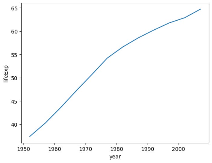
Line Plot : Follow the definition in the Matplotlib section.
import seaborn as sns
sns.lineplot(data=temp_df, x='year', y='lifeExp') # Axis level

or

sns.relplot(data=temp_df, x='year', y='lifeExp', kind='line') # Figure level
Distribution Plots
used for univariate analysis
used to find out the distribution
Range of the observation
Central Tendency
is the data bimodal?
Are there outliers?
Plots under distribution plot
Histplot / Histogram : Follow the definition in the Matplotlib section.
sns.histplot(data=tips, x='total_bill') # Axes level

or

sns.displot(data=tips, x='total_bill', kind='hist') # Figure level
Kde plot : The distribution of a continuous variable can be seen using a kernel density estimation (KDE) plot, a data visualisation approach used in statistics and data analysis. KDE plots may be easily and attractively made using Seaborn, a popular Python data visualisation framework built on top of Matplotlib.
sns.kdeplot(data=tips,x='total_bill') #Axes Level

or

sns.displot(data=tips,x='total_bill',kind='kde') # Figure level
Rug plot : A rug plot is a type of data visualization that is frequently combined with histograms and kernel density estimation (KDE) displays. It creates a visual representation of the distribution of the data by showing each individual data point as a little tick mark or line along a single axis.
sns.kdeplot(data=tips,x='total_bill')
sns.rugplot(data=tips,x='total_bill')
Matrix Plot
Heatmap
A common method of displaying data in a two-dimensional matrix format with values denoted by colours is called a heatmap. Heatmaps may easily be made in a quick and simple manner using Seaborn, a Python data visualisation framework built on top of Matplotlib. When studying patterns in large datasets or visualising correlations between two categorical variables, heatmaps are especially helpful.
import seaborn as sns
import matplotlib.pyplot as plt

# Sample data (correlation matrix)
data = sns.load_dataset("iris")
correlation_matrix = data.corr()

# Create a heatmap of the correlation matrix
sns.heatmap(data=correlation_matrix, annot=True, cmap="coolwarm")

# Add title
plt.title("Correlation Heatmap")

# Show the plot
plt.show()
2. Cluster map
In order to display a heatmap with hierarchical clustering applied to both the rows and columns of the data matrix, a cluster map is a common data visualization technique. By putting comparable rows and columns together, this kind of visualization can make it simpler to spot structure and trends in the data and expose patterns and linkages in complicated datasets. The Python data visualization module Seaborn offers a simple method for producing cluster maps.
import seaborn as sns
import matplotlib.pyplot as plt

# Sample data (correlation matrix)
data = sns.load_dataset("iris")
correlation_matrix = data.corr()

# Create a clustermap of the correlation matrix
sns.clustermap(data=correlation_matrix, cmap="coolwarm")

# Add title
plt.title("Clustermap of Correlation Matrix")

# Show the plot
plt.show()


